

Light blue has earned its reputation as one of the most versatile colors for bedroom design. It bridges the gap between bold statement and neutral backdrop, offering calming effects without the sterility of white or the heaviness of navy. Whether someone is repainting a single accent wall or redesigning an entire sleep space, light blue provides a foundation that works across design styles, from coastal to contemporary to farmhouse. This guide walks through practical approaches to incorporating light blue into bedroom design, covering paint selection, application techniques, color pairings, and finishing touches that turn a simple color choice into a cohesive, restful retreat.
Table of Contents
ToggleKey Takeaways
- Light blue bedroom ideas work best because the color triggers physiological responses that lower heart rate and cortisol levels, making it ideal for restful sleep while avoiding the sterility of white or heaviness of navy.
- Choose light blue paint shades between 60–75 LRV (light reflectance value), and always test 2×2-foot samples directly on bedroom walls under different lighting conditions before committing to full coverage.
- Balance light blue’s cool tones with warm accents through natural wood furniture, brass or copper fixtures, and soft textiles like linen or wool rugs to prevent the space from feeling sterile.
- Use a single accent wall behind the bed for color impact, and apply two coats of paint using proper prep work (spackling, sanding, wiping dust) and painter’s tape for clean, professional results.
- Layer different textures in bedding—combining smooth cotton sheets, linen duvets, chunky knit throws, and velvet pillows—to create visual depth and prevent the monotony of a flat monochromatic look.
- Select floor-to-ceiling curtains in cream, white, or soft gray to maintain the calm atmosphere while adding height perception, especially important in rooms with standard 8-foot ceilings.
Why Light Blue Works Perfectly in Bedrooms
Light blue triggers physiological responses that support rest. Studies in environmental psychology consistently show that blue tones lower heart rate and reduce cortisol levels, both critical for quality sleep. Unlike stimulating reds or yellows, light blue registers as non-threatening to the brain’s visual processing centers.
The color also manipulates perceived room dimensions. Cooler tones recede visually, making walls appear farther away than they are. This optical effect makes smaller bedrooms (10×12 feet or under) feel more open without requiring structural changes. In larger master suites, light blue prevents the cavernous emptiness that pure white can create.
Light reflectance value (LRV) matters here. Most light blue paints fall between 60–75 LRV, meaning they reflect enough light to keep rooms bright while providing enough pigment to avoid the clinical feel of high-LRV whites (85+). This range works especially well in north-facing bedrooms that receive limited natural light.
The color’s flexibility across demographics is another practical advantage. It skews neither strongly masculine nor feminine, works for all ages, and doesn’t become visually tiresome over time, a key consideration since most homeowners repaint bedrooms every 5–7 years.
Choosing the Right Shade of Light Blue for Your Bedroom
Paint manufacturers categorize “light blue” across dozens of formulations. The wrong shade creates problems: too gray reads as cold, too green feels aquatic, too purple looks dated.
Test before committing. Purchase sample pots (typically 8 oz) of three to five shades. Paint 2×2-foot squares directly on the bedroom walls, not on poster board, which doesn’t reflect the same light. Observe them at different times: morning sunlight, afternoon shade, and artificial lighting at night. Colors shift dramatically based on light source color temperature (warm 2700K bulbs versus cool 5000K LEDs).
For rooms with warm oak or pine trim, choose light blues with slight gray undertones (sometimes labeled “blue-gray” or “slate blue”). These prevent jarring contrast. With white or painted trim, cleaner light blues without gray work well.
Ceiling height influences shade selection. In rooms with standard 8-foot ceilings, stick to lighter shades (LRV 65+). In rooms with 9+ foot ceilings, mid-tone light blues (LRV 55–65) prevent the ceiling from feeling too distant.
Sheen affects the final appearance as much as color. Eggshell (10–25% sheen) hides minor wall imperfections while remaining washable, the standard choice for bedrooms. Flat/matte shows every flaw but offers the truest color. Semi-gloss works only on perfectly smooth walls and can make light blue appear more saturated than intended.
Light Blue Accent Walls and Paint Techniques
A single accent wall delivers color impact with less paint, less time, and easier future changes than four-wall coverage. The wall behind the bed is the standard choice, it’s the visual anchor when entering the room and doesn’t interfere with furniture placement on other walls.
Prep determines the finish quality. Fill nail holes with lightweight spackling compound, let dry 2 hours, then sand smooth with 120-grit paper. Wipe walls with a damp cloth to remove dust (this step matters, dust creates texture under fresh paint). Prime only if covering a darker color, painting over fresh drywall, or dealing with stains. Modern paint-and-primer combinations work for most repainting projects over existing neutral colors.
For clean lines at ceiling and trim, apply painter’s tape (3M ScotchBlue Advanced or similar multi-surface type). Press edges firmly with a putty knife to prevent bleed-through. Cut in (brush-paint) a 3-inch border at all edges first, then roll the field. Use a ½-inch nap roller for smooth walls, ⅜-inch for very smooth, ¾-inch for textured.
Two coats provide proper coverage and color accuracy. The first coat often looks streaky or translucent, this is normal. Wait 4 hours minimum between coats (check the can: some require longer). Remove painter’s tape while the second coat is still slightly tacky (about 1 hour after application) to prevent peeling dried paint.
Ombre and gradient techniques, fading light blue into white, create visual interest but require more skill. They work best on accent walls and demand careful blending with a dry brush while paint is wet. Homeowners uncomfortable with freehand blending should stick to solid color application.
Complementary Colors and Decor Pairings
Light blue is a cool color that needs warm counterbalances to avoid feeling sterile. The color wheel offers guidance, but practical bedroom use requires more nuance than theory.
White remains the safest trim and ceiling choice. It provides crisp contrast without competing for attention. Off-whites with warm undertones (cream, ivory) soften the look, particularly important in bedrooms with light blue-gray paint where pure white can feel harsh.
Natural wood tones add warmth that light blue lacks. Medium oak, walnut, or birch furniture grounds the space. Light pine or whitewashed wood can work but risks looking too beachy unless balanced with darker textiles.
For accent colors, different approaches to bedroom styling lean toward soft neutrals and natural textures that complement rather than compete with light blue walls. Burnt orange, terracotta, and warm rust tones sit opposite blue on the color wheel, creating energizing contrast, use these in small doses through throw pillows or artwork. Coral and peach offer softer versions of this contrast.
Gray anchors light blue without adding warmth or coolness. Charcoal gray bedding or curtains creates a modern, sophisticated palette. Lighter grays risk looking washed out unless they have enough contrast with the wall color (minimum 10-point LRV difference).
Metallic finishes matter. Brushed brass, copper, and gold read as warm and pair naturally with light blue. Chrome and polished nickel maintain the cool temperature, effective for contemporary spaces but potentially cold in traditional bedrooms.
Light Blue Bedding and Textile Ideas
Bedding sets the bedroom’s functional tone. Solid light blue duvet covers or comforters create a monochromatic, hotel-like effect, calming but potentially flat without textural variation.
Layering different textures prevents monotony. Combine smooth cotton sheets with a linen duvet, add a chunky knit throw at the foot, and finish with velvet or faux fur accent pillows. Each material reflects light differently, creating visual depth even though similar color values.
Pattern introduction requires restraint. Ticking stripes (narrow black, navy, or gray stripes on white or light blue) add structure without overwhelming. Geometric patterns work if they incorporate the room’s accent colors. Avoid small, busy florals, they compete with the wall color rather than complementing it.
Many interior design trends for bedrooms emphasize the impact of window treatments on overall room cohesion. For light blue bedrooms, curtains in natural linen or cotton in cream, white, or soft gray filter light effectively while maintaining the calm atmosphere. Floor-to-ceiling panels (mounted close to the ceiling, not at the window frame) add height perception, critical in rooms with standard 8-foot ceilings.
Blackout linings matter for sleep quality but affect color appearance. Standard blackout fabric adds bulk and often a rubberized texture. Double-lining with a white blackout layer behind a decorative fabric preserves the intended drape and appearance.
Rug selection grounds the space. Natural fiber rugs (jute, sisal, seagrass) add warmth and texture. Wool rugs in cream, ivory, or warm gray provide softness underfoot. Area rugs should extend at least 18 inches beyond the bed on three sides for proper visual balance.
Furniture and Accessory Choices for Light Blue Bedrooms
Furniture weight, visual, not physical, determines whether a light blue bedroom feels cohesive or disconnected. Dark furniture (espresso, black, deep walnut) creates high contrast that works in larger rooms but can fragment smaller spaces. Light or medium wood tones integrate more naturally.
Upholstered headboards introduce texture and can repeat the wall color in a different material (velvet light blue headboard against matte light blue walls) or provide contrast. Linen or boucle in cream, oatmeal, or warm gray adds softness. Tufted headboards create traditional elegance: channel-tufted or plain panels read more contemporary.
Nightstand and dresser finishes should match or intentionally contrast, never accidentally mismatch. A light oak bed frame with medium walnut nightstands looks unintentional. Better combinations: matching wood tones throughout, or painted furniture (white, cream, gray) mixed with natural wood.
Lighting fixtures affect how light blue appears after dark. Warm white bulbs (2700–3000K) make light blue appear slightly grayer or greener. Daylight bulbs (5000K+) maintain color accuracy but feel clinical in bedrooms. Soft white (3000–3500K) splits the difference, warm enough for evening comfort, neutral enough to avoid color distortion.
Many room refresh projects focus on accessories that personalize without permanent commitment. For light blue bedrooms, artwork with warm undertones (landscapes with golden hour lighting, abstract pieces with terracotta or rust) prevents the space from skewing too cool. Black-framed pieces add definition: natural wood frames add warmth.
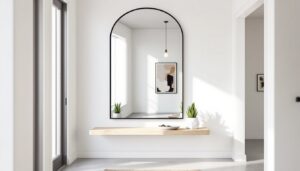
Mirrors expand perceived space but placement matters. Position them to reflect windows or light sources, not to face the bed (many people find this unsettling). Oversized leaning mirrors (5–6 feet tall) work in corners: smaller mirrors (2×3 feet) work above dressers.
Plants add life but require adequate light. Low-light tolerant options (pothos, snake plant, ZZ plant) survive north-facing bedrooms. Avoid flowering plants in bedrooms, some people are sensitive to nighttime pollen.
Conclusion
Light blue bedrooms succeed when color selection matches the room’s natural light, paint application follows proper prep and technique, and complementary colors add necessary warmth. The difference between a successful light blue bedroom and one that feels cold or incomplete comes down to intentional choices in texture, contrast, and finishing details. Test paint samples in actual conditions, invest time in surface preparation, and balance cool wall color with warm accents in wood, metal, and textiles. The result is a bedroom that promotes rest without sacrificing style or personality.